Jul 9, 2025
How-to

by
Stephanie Ohumu
Graphs are a powerful way to convey important aspects of a large amount of data in a concise manner. And like all powerful tools, they must be wielded with care. Misinterpretation of graphs can lead to costly mistakes, in money, time, and sometimes even lives.
This isn't hyperbole. The 1986 NASA Challenger disaster hinged on a graph about critical shuttle components in cold weather. The data was incomplete, its interpretation was flawed, and most critically, it was misused in overriding engineering concerns about the launch. Seven lives were lost, and space exploration was set back for years.
While the graph your sales rep just shared may not have life or death consequences, decisions made based on it can ripple through your entire organization. So today, we'll learn how to correctly read a graph.
To make sense of a graph you encounter in the wild follow these steps:
Key steps to reading a graph
1. What is this graph showing?
Where to look: Start with the title, subtitle, and any text above or below the graph.

Before diving into the numbers, figure out what you're actually looking at. Are you seeing data about customers, sales transactions, website visits, or something else entirely? The title should tell you, but sometimes it's vague or misleading.
Think of it this way: if each bar or point on the graph represents one "thing," what is that thing? Is it one customer, one sale, one day, one product? This matters because a graph showing "revenue" could be measuring how much each customer spent, how much each product made, or how much was earned each month. Each tells a completely different story.
2. What numbers are being measured?
Where to look: Check the numerical scale label (the vertical axis on the left in most graphs) and any numbers on the graph itself.
Once you know what the graph is about, figure out what's being counted or measured. If it's about customers, are we looking at their age, how much they spent, how many times they bought something? If it's about sales, are we measuring dollar amounts, number of items, or profit margins?
The numerical scale should clearly tell you what's being measured. If it's unclear or missing entirely, that's your first warning sign that this graph might not be trustworthy.
3. What units are we talking about?
Where to look: Check the vertical axis label for units, look for small print near the axes, and scan for any notes about scale.
Are we talking about dollars, thousands of dollars, millions? Are those percentages or raw numbers? Is time measured in days, months, or years? This sounds basic, but it's where many people get tripped up.
Watch out for tricks. A graph showing "Revenue (000s)" means you need to add three zeros to every number. So if the bar shows "50," that's actually $50,000. Similarly, percentages can be misleading, a 100% increase sounds huge until you realize it went from 2 customers to 4 customers.
4. Are these totals or averages?
Where to look: Check the title and axis labels for words like "total," "average," "per customer," or "each month."
This is huge. There's a world of difference between "total revenue" and "average revenue per customer." One tells you how much money came in overall, the other tells you how much the typical customer spent. You need to know which one you're looking at.
Look for clues like "total," "sum," "average," "mean," or phrases like "per customer" or "per month." If you can't tell, be skeptical of any conclusions you draw.
5. What are the numbers plotted against?
Where to look: Check the horizontal axis, the legend and any different colors or patterns in the graph.

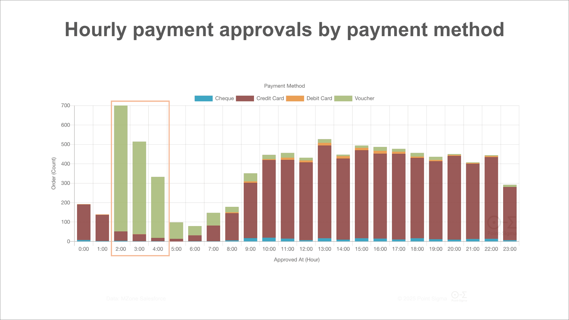
This is about understanding both what's being measured and how it's categorized. First, read the horizontal axis variable name carefully. What does it mean? Most of the time, people overlook the actual metric, especially if there are multiple options (e.g., time variables). Approved Date is different from Purchased date, and Purchased Date is different from Delivered to Customer Date.
Many graphs also split data into different groups within each horizontal axis point, maybe showing sales by month with separate bars for each product line, or website visits by age group with different lines for desktop vs mobile users. This is where you'll find the most interesting insights, but also where things can get confusing. Look at how the data is divided up into groups. Are we seeing results split by department? By customer type? By geographic region? How are those groups defined? Sometimes the same customer or sale can appear in multiple groups, which affects what the totals mean.
6. What type of graph is this and what does that tell you?
Different graph types are designed for different purposes:
Line graphs show one variable changes in relation to another, with the horizontal axis divided into equal intervals.. They're great for spotting trends and patterns. But be careful, if the line goes up steeply, check the time period. A 50% increase over five years is very different from a 50% increase over five months.
Bar charts compare different categories side by side. They make it easy to see which is biggest or smallest. But watch out for missing categories, sometimes the most important information is what's not shown.

Pie and doughnut charts show how a whole thing is divided into parts. They're intuitive, but they only work when the pieces actually add up to something meaningful. A pie chart showing "reasons customers called" makes sense, but "favorite colors of our customers" might not tell you anything useful.
Scatter plots show how two numerical things are related. Lots of dots trending upward might suggest a connection, but remember: just because two things happen together doesn't mean one causes the other.
7. What patterns do you see?
Now for the fun part: what story is the data telling?
Trends: Is the line going up, down, or staying flat? Over how long? Are there obvious seasonal patterns, like higher sales in December?
Outliers: Are there points that look completely different from the rest? These might be errors, or they might be your most important insights. A sudden spike in customer complaints might point to a specific problem you can fix.
Comparisons: If you're comparing different groups, which ones stand out? Are the differences big enough to matter in the real world?
Missing pieces: Are there gaps in time or missing categories? Sometimes what's not shown is as important as what is.
8. What's the bigger picture?
No graph tells the whole story. Always ask yourself:
Time frame: A graph showing "recent growth" could mean last month or last decade. Make sure you know which.
What's missing: What other information would help you understand this better? Are there other metrics or time periods that would change your conclusion?
Who made this and why: Was this graph created to inform or to persuade? What might the creator want you to think?
How does this compare: Is this performance good or bad compared to your competitors, your past results, or your goals?
What else was happening: Were there external factors that might explain what you're seeing? A big marketing campaign, a competitor's new product, or economic changes?
Be extra careful when you see:
Graphs where the numerical scale doesn't start at zero (this can make small changes look huge)
Missing time periods or categories
No clear source or explanation of where the data came from
Overly complicated graphs that seem designed to confuse rather than clarify
Results that seem too good or too bad to be true

What to do next
After going through these steps, you should be able to say in plain English: "This graph shows [what] measured by [what numbers] for [what time period/groups], and the main takeaway is [pattern you see]."
If you can't complete that sentence, you need more information before making any decisions based on the graph.
Remember: a good graph should make you smarter, not just confirm what you already thought. The best graphs raise good questions and point you toward deeper investigation. Your job is to read them carefully and think critically about what they're really telling you.